
Infographic software
Topics: experimenting with Tableau. Infographic examples.
Code: Tableau / Tool: Tableau
Tableau is a powerful BI software for data analytics and visualization. Other similar point-and-clik software: QLik, Power BI, and MicroStategy.
All cases were done on Tableau desktop and five of them were exported to Tableau public. Consult the online profile.
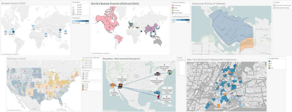
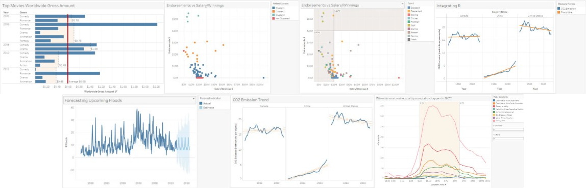
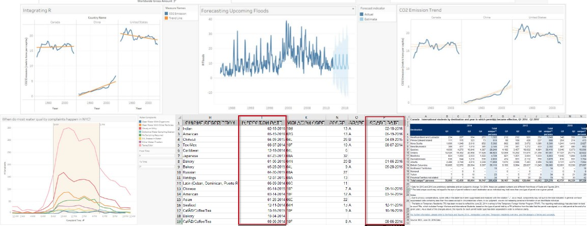
- Case 1: 2015 World Population; data from Gapminder and the World Bank;
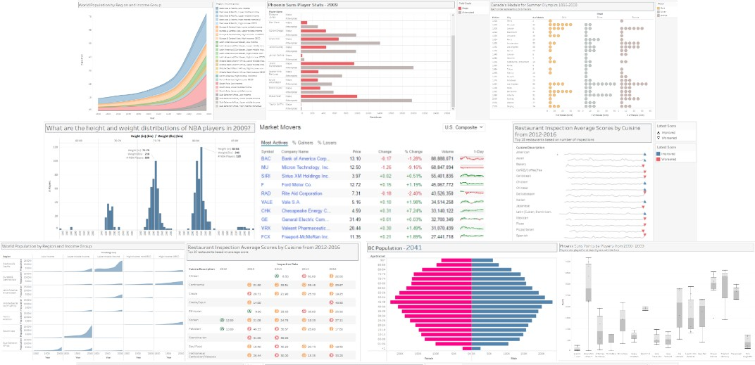
- Case 2: Canada’s Medals for Summer Olympics, 1896-2008; data from Kaggle;
- Case 3: BC Population Pyramid; data from BC Stats (Population Projections);
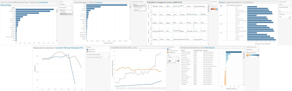
- Case 4: CO2 Emission Trend; data from the World Bank (World Development Indicators).
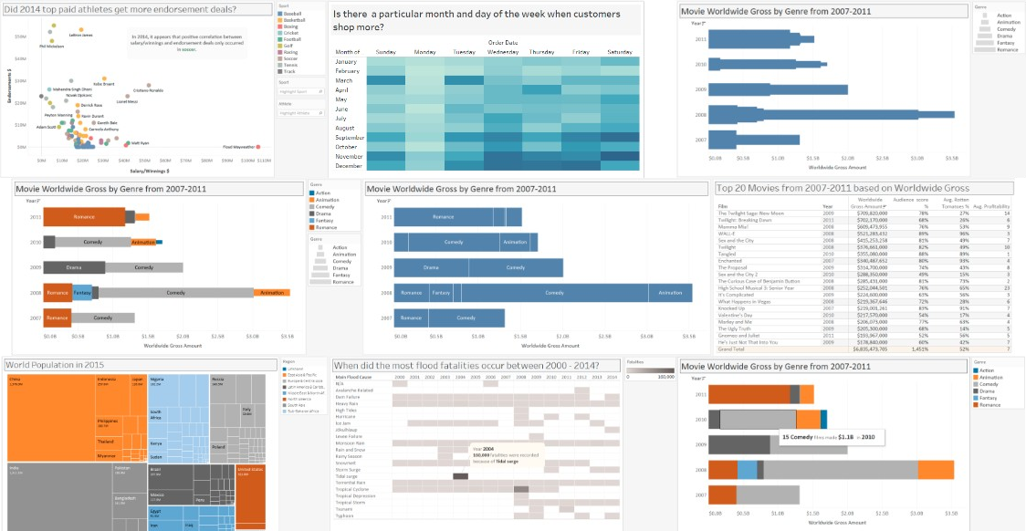
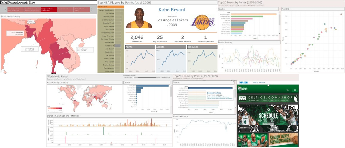
- Case 5: Worldwide Floods; charts, dashboard, and story; data from the The Humanitarian Data Exchange.
- All cases (only the above cases are online):
 |
 |
|---|---|
 |
 |
 |
 |
 |
 |
A special thank to Katy Börner who is widely known for her Atlas books explaining the purposes and practices of science mapping to navigate, manage, and utilize knowledge spaces. The Atlas of Science won the 2011 Best Information Science Book award from the Association for Information Science and Technology (ASIS&T) and reviews in major magazines.
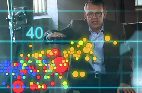
Another thank to Hans Rosling (1948-2017), a pioneer in data visualization. He co-founded the Gapminder Foundation. He used data compiled by the UN and the World Bank to explain healthcare statistics with animated graphics.
Many women have brought presentations to new levels beyond the simple chart or map. Julie Steele, Isabel Meirelles, Dona M. Wong, Tamara Munzner, Cole Nussbaumer Knaflic and Stephanie D. H. Evergreen are among those who have turned data visualization into a design of information.
Other books by Nathan Yau, Manuel Lima or David McCandless, to name a few, are worth seeing. Of course, we do not forget the pioneers such as Edward Tufte and Stephen Few. Daniel Rosenberg’s book identified visualization from other centuries such as Charles Joseph Minard’s map about the Napoleon retreat from Russia in 1812, or John Snow’s map about an epidemic in London, in 1854.