Foreword
- Snippets and results.
- Source: 'Exploring Pitch Data with R' from DataCamp fitted into Jupyter/IPython using the IRkernel.
Clean the data
The data contain information about every pitch thrown by Zack Greinke during the 2015 regular season.
These data include over 3,200 individual pitches and 29 variables associated with the game date, inning, location, velocity, movement, pitch type, pitch results, at bat results, and more.
There are some missing data in the start_speed variable that will require removal. You can easily do this with the subset() function, which takes a dataset or vector you wish to subset and a conditional statement that tells R how it is you wish to subset. Once you have the data prepped and understand some of the basic characteristics of the variables, we can move onto some interesting analyses of Greinke's 2015 season statistics.
First, load the data and take it a look
greinke <- read.table(file = 'Baseball.csv', header = TRUE, sep = ';')
# Print the first 6 rows of the data
head(greinke, 6)
tail(greinke,6)
# Print the number of rows in the data frame
nrow(greinke)
# Check out the dataset
str(greinke)
# Convert some data
greinke$p_name <- as.character(greinke$p_name)
# Check out the dataset again
str(greinke$p_name)
str(greinke$pitch_id)
# Summarize the start_speed variable
summary(greinke$start_speed)
hist(greinke$start_speed)

# Get rid of data without start_speed
greinke <- subset(greinke, is.na(start_speed) == FALSE)
# Print the number of complete entries
nrow(greinke)
Check dates
It turns out that the game_date variable in the greinke dataset has been stored as a character string instead of a date. The as.Date() function is helpful here.
# Check if dates are formatted as dates
class(greinke$game_date)
# Change them to dates
greinke$game_date <- as.Date(greinke$game_date, format = "%m/%d/%Y", origin = "01/01/1900")

# Check that the variable is now formatted as a date
class(greinke$game_date)
Delimit dates
Split up the dates so that you have a month, day, and year variable in the data to group the data for later analyses.
Leverage the separate() function from the tidyr package. This function allows to easily split an existing column ('col') in a data frame ('data') into new columns, which are specified with the into argument (e.g. into = c("year", "month")). Lastly, the remove argument tells R whether to remove the original column from the data and the sep argument tells R what to split on.
The ifelse() function will help to make the new variable july for later computations.
age <- c(3, 12, 32, 40, 17)
ifelse(age < 19, 'child', 'adult')
This ifelse() statement returns 'child' or 'adult' depending on whether the conditional statement age < 19 is TRUE or FALSE.
# load tidyr package
# install.packages('tidyr') in R
library(tidyr)
# Separate game_date into "year", "month", and "day"
greinke <- separate(data = greinke, col = game_date,
                    into = c("year", "month", "day"),
                    sep = "-", remove = FALSE)
str(greinke)
# Convert month to numeric
greinke$month <- as.numeric(greinke$month)

# Create the july variable
greinke$july <- ifelse(greinke$month == 7, "july", "other")
str(greinke)
# View the head() of greinke
head(greinke)
# Print a summary of the july variable
summary(factor(greinke$july))
Velocity distribution
Now that the data are ready to go, it can be useful to look at the distribution of start_speed (velocity in miles per hour) of Greinke's pitches; across pitch_type and or across month to assess distributional differences across these groups.
Narrow down the interest to just four-seam fastballs. Subset the data for July and other months and make histograms for all pitches. Group by the july variable to show side-by-side histograms for comparison.
# Make a histogram of Greinke's start speed
hist(greinke$start_speed)
# Create greinke_july
greinke_july <- subset(greinke, greinke$july == "july")

# Create greinke_other
greinke_other <- subset(greinke, greinke$july != "july")

# Use par to format your plot layout
par(mfrow = c(1, 2))

# Plot start_speed histogram from july
hist(greinke_july$start_speed)

# Plot start_speed histogram for other months
hist(greinke_other$start_speed)

Fastball velocity distribution
Notice that the distribution of pitches was strongly skewed. This is because it includes both offspeed pitches and fastballs. Offspeed pitches tend to have lower velocities, so the distribution has a long tail.
This time, look only at four-seam fastballs (denoted as "FF" under the pitch_type variable) in order to evaluate the distribution of the hardest pitch thrown by Greinke. Compare July relative to other months.
# Create july_ff (fastballs)
july_ff <- subset(greinke_july, pitch_type == "FF")

# Create other_ff
other_ff <- subset(greinke_other, pitch_type == "FF")

# Formatting code, don't change this
par(mfrow = c(1, 2))

# Plot histogram of July fastball speeds
hist(july_ff$start_speed)

# Plot histogram of other month fastball speeds
hist(other_ff$start_speed)

The distributions look more symmetrical now, but plotted side-by-side, it's hard to tell whether Greinke's four-seam fastballs were on average slower or faster in July compared to those from all other months.
Distribution comparisons with color
When plotting histograms on different panels, it can sometimes be difficult to evaluate whether one is shifted to the left or right, relative to the other. This is especially the case when there are only small differences.
You can often get more insight from two histograms when they are plotted overlapping one another. It's even more helpful to incorporate transparent colors. Using the hex color scale, where col = "#rrggbbaa", rr defines the amount of red, gg the amount of green, bb the amount of blue, and aa the level of transparency. All four are specified on a scale from 00 to 99.
In addition to the histogram, it can also be instructive to plot the mean of each group for more direct comparison.
# Make a fastball speed histogram for other months
hist(other_ff$start_speed,
     col = "#00009950", freq = FALSE,
     ylim = c(0, 0.40), xlab = "Velocity (mph)",
     main = "Greinke 4-Seam Fastball Velocity")

# Add a histogram for July
hist(july_ff$start_speed,
     col = "#99000050", freq = FALSE,
     add = TRUE)

# Draw vertical line at the mean of other_ff
abline(v = mean(other_ff$start_speed), col = '#00009950', lwd = 2)

# Draw vertical line at the mean of july_ff
abline(v = mean(july_ff$start_speed), col = '#99000050', lwd = 2)

tapply() for velocity changes
There are differences in start_speed between July and other months for all pitch types; then for four-seam fastballs only.
tapply() allows to apply other functions (e.g. mean()) to a continuous variable for each group of a factor (categorical) variable using only a single line of code.
# Summarize velocity in July and other months
tapply(greinke$start_speed, greinke$july, mean)
# Create greinke_ff
greinke_ff <- subset(greinke, pitch_type == "FF")

# Calculate mean fastball velocities: ff_velo_month
ff_velo_month <- tapply(greinke_ff$start_speed, greinke_ff$july, mean)

# Print ff_velo_month
ff_velo_month
Game-by-game velocity changes
Now, look at velocity by game_date using a new dataset, which is a subset of four-seam fastballs only.
Use tapply() in combination with the data.frame() functionThis requires some renaming of columns and rows.
# Create ff_dt
ff_dt <- data.frame(tapply(greinke_ff$start_speed, greinke_ff$game_date, mean))

# Print the first 6 rows of ff_dt
head(ff_dt, 6)
Tidying the data frame
Game dates are now the row names of the new dataset ff_dt. Include the row names as a variable in ff_dt, formatted as dates.
# Create game_date in ff_dt
ff_dt$game_date <- as.Date(row.names(ff_dt), "%Y-%m-%d")

# Rename the first column
colnames(ff_dt) <- c('start_speed', 'game_date')

# Remove row names
row.names(ff_dt) <- NULL

# View head of ff_dt
head(ff_dt)
A game-by-game line plot
The printed dataset is already ordered by the game_date variable. The tapply() function does this automatically when it calculates the group-level statistics.
Plot Zack Greinke's fastball velocity on a game-by-game basis using a line plot.
# Plot game-by-game 4-seam fastballs
plot(ff_dt$start_speed ~ ff_dt$game_date,
     lwd = 4, type = "l", ylim = c(88, 95),
     main = "Greinke 4-Seam Fastball Velocity",
     xlab = "Date", ylab = "Velocity (mph)")

Adding jittered points
It can sometimes be helpful to plot individual pitches as points() along with the game average line. The points() function takes three arguments: a formula that specifies which values should be added as points against which variable, pch that specifies what kind of points should be added to the plot, and col that specifies the color of the points to be added. Because the x-axis is discrete, use the jitter() function within the points() call to ensure the points don't overlap too much.
Pairing jitter() with transparent coloring allows for better visualization of the density of each velocity for each game.
# Code from last exercise, don't change this
plot(ff_dt$start_speed ~ ff_dt$game_date,
     lwd = 4, type = "l", ylim = c(88, 95),
     main = "Greinke 4-Seam Fastball Velocity",
     xlab = "Date", ylab = "Velocity (mph)")

# Add jittered points to the plot
points(jitter(ff_dt$start_speed) ~ jitter(as.numeric(ff_dt$game_date)),
    pch = 16, col = "#99004450")

Pitch mix tables
So far, the focus was mainly on velocity of pitches.
There are other characteristics that make a pitcher successful: pitch mix and location. For example, perhaps the increased velocity led to Greinke taking advantage of his fastball a bit more. Or maybe it made his off-speed pitches more effective, ultimately leading to greater usage of these pitch types.
Use the table() and prop.table() functions to explore changes in pitch mix. We switch from tapply() to the table() functions here due to the fact that the variable of interest, pitch_type, is categorical. This allows us to see how many of each type of pitch were thrown in July compared to other months; proportions are easier to interpret.
Note that there are some pitches we're not very interested in, so you will first subset the data to remove Eephus pitches and intentional balls. Eephus pitches were most likely misclassified by the automated pitch classifier.
# Subset the data to remove pitch types "IN" and "EP"
greinke <- subset(greinke, pitch_type != "IN" & pitch_type != "EP")

# Drop the levels from pitch_type
greinke$pitch_type <- droplevels(greinke$pitch_type)

# Create type_tab
type_tab <- table(greinke$pitch_type, greinke$july)

# Print type_tab
type_tab
Pitch mix table using prop.table() with the data frame that displays the number of pitches broken down by pitch type:
> type_tab

     july other  legend
  CH  112   487  CHangeup
  CU   51   242  CUrveball
  FF  207  1191  Four-seam Fastball
  FT   66   255  Two-seam Fastball
  SL   86   535  SLider
To learn more about pitch types and abbreviations.
It is more informative and interpretable when the information is presented as proportions using the prop.table() function. This function takes two arguments: a table (e.g. type_tab) and the margin over which to compute proportions.
Use margin = 2, which tells R to compute proportions within each column. That is, the proportions in each column of the result will sum to one.
If the margin argument is not specified, the proportions are computed relative to the entire table (i.e. the entire table sums to one).
# Create type_prop table
type_prop <- round(prop.table(type_tab, margin = 2), 3)

# Print type_prop
type_prop
Notice that each column in type_prop sums to one because prop.table() with argument margin = 2 computes proportions within each column.
Pitch mix tables - July vs. other
Next, compare the velocity to fastball usage overall. In doing so, gauge whether a quicker fastball increases the use of that pitch, maybe due to increased effectiveness.
Alternatively, if the proportion of non-fastball pitches increases alongside fastball velocity, this could indicate that Greinke sees the non-fastball pitches as being more effective when there's a larger difference in velocity between them and his fastball.
# Create ff_prop
ff_prop <- type_prop[3,]

# Print ff_prop
ff_prop

# Print ff_velo_month
ff_velo_month
Pitch mix tables - changes in pitch type rates
Now, calculate the difference in pitch type rates for July and the other months.
To do so, simply subtract one column from the other in the type_prop data frame.
However, it might be most useful to understand the percentage change (rather than the absolute change in proportion), so make this small transformation in your code.
# Create the Difference column
# type_prop$Difference <- (type_prop$july - type_prop$other) / type_prop$other
type_prop$Difference <- (type_prop[,1] - type_prop[,2]) / type_prop[,2]
# Print type_prop
type_prop$Difference
# Plot a barplot
barplot(type_prop$Difference, names.arg = type_prop$Pitch,
        main = "Pitch Usage in July vs. Other Months",
        ylab = "Percentage Change in July",
        ylim = c(-0.3, 0.3))

Greinke decreased his slider (SL) much more in July than any other pitch.
Ball-strike count frequency
While pitch types are interesting in their own right, it might be more useful to think about what types of pitches Greinke uses in different ball-strike counts.
Before getting to that, first make a table to examine the rate at which Greinke throws pitches in each of the ball-strike counts.
# Create bs_table
bs_table <- table(greinke$balls, greinke$strikes)

# Create bs_prop_table
bs_prop_table <- round(prop.table(bs_table), 3)

# Print bs_prop_table
bs_prop_table
# Print row sums
rowSums(bs_prop_table)
# Print column sums
colSums(bs_prop_table)
Notice that the proportion of pitches thrown decreases as balls or strikes increases. This makes sense, since the lower order counts have to be passed through in order to get to more balls or more strikes.
Make a new variable
Create a new variable called bs_count that combines the balls and strikes variables into a single ball-strike count.
# Create bs_count
greinke$bs_count <- paste(greinke$balls, greinke$strikes, sep = "-")

# Print the first 6 rows of greinke
head(greinke)
Ball-strike count in July vs. other months
Identify the percentage change in the rate at which Greinke put himself in each of the ball-strike counts.
# Create bs_count_tab
bs_count_tab <- table(greinke$bs_count, greinke$july)

# Create bs_month
bs_month <- round(prop.table(bs_count_tab, margin = 2), 3)

# Print bs_month
bs_month
This is interesting. It looks like Greinke got into more 1-0 and 2-0 counts, but less two strike counts. That's a bit unexpected, since he had so much July success.
Visualizing ball-strike count in July vs. other months
Create a bar plot to visualize how common each ball-strike count was in July vs. other months. Let's get started.
# Create diff_bs
diff_bs <- round(((bs_month[,1] - bs_month[,2]) / bs_month[,2]),3)

# Print diff_bs
diff_bs
# Create a bar plot of the changes
barplot(diff_bs, main = "Ball-Strike Count Rate in July vs. Other Months",
        ylab = "Percentage Change in July", ylim = c(-0.15, 0.15), las = 2)

Cross-tabulate pitch use in ball-strike counts
Interestingly, Greinke was in more hitter friendly counts in July than the other months in which he pitched. That's a somewhat unexpected result.
It could be that he was more willing to use off-speed pitches earlier in the count, and if those are thrown for strikes less often, then this might be driving this result. You will look at these outcomes a bit more in the last chapter of this course.
Take a look to see if Greinke used certain pitches more or less often in specific counts overall. In particular, tabulate the proportion of times he throws each pitch for each count.
# Create type_bs
type_bs <- table(greinke$pitch_type, greinke$bs_count)

# Print type_bs
type_bs
# Create type_bs_prop
type_bs_prop <- round(prop.table(type_bs, margin = 2), 3)

# Print type_bs_prop
type_bs_prop
- He used his 4-seam fastball more than any other pitch in 3-0 counts.
- He used his slider most when he had 2 strikes on a batter.
- He never threw his curveball in a 3-0 or a 3-1 count.
Pitch mix late in games
There is often talk about pitchers having more trouble late in games. There are a number of reasons for this. They could be getting tired and losing velocity, or batters may have already seen pitches they throw. Given this, we'll try to see if Greinke resorts more to his off-speed pitches later in games.
First, create a variable indicating that a pitch was thrown late in a game, defined as any pitch past the 5th inning. Then, make a table of pitch selection for late-game pitches.
# Create the late_in_game column
greinke$late_in_game <- ifelse(greinke$inning > 5, 1, 0)

# Convert late_in_game
greinke$late_in_game <- factor(greinke$late_in_game)

# Create type_late
type_late <- table(greinke$pitch_type, greinke$late_in_game)

# Create type_late_prop
type_late_prop <- round(prop.table(type_late, margin = 2), 3)

# Print type_late_prop
type_late_prop
Late game pitch mix - grouped barplots
Assess whether there are changes in pitch selection for specific pitches early vs. late in the game.
Use the barplot() function, which also allows for creation of grouped barplots, paired with the transpose function, t(), and the parameter beside = TRUE.
# Create t_type_late
t_type_late <- t(type_late)

# Print dimensions of t_type_late
dim(t_type_late)
# Print dimensions of type_late
dim(type_late)
# Change row names
rownames(t_type_late) <- c("Early", "Late")
t_type_late
# Make barplot using t_type_late
barplot(t_type_late, beside = TRUE, col = c("red", "blue"),
        main = "Early vs. Late In Game Pitch Selection",
        ylab = "Pitch Selection Proportion",
        legend = rownames(t_type_late))

Conclusions:
- He uses his fastballs less often late in games.
- He uses his FF in all-ball-strike counts.
- The more balls, the more FF. In 3-0 counts, FF 90% of the time.
- With 2 strikes on the batter, more SL.
- Pitch Mix: doesn't pitch FF and FT (4-seam and 2 seam fastballs) late in the game. Tired?
- Educated guesses: tired, cannot through as fast or cheat the batters?
Locational changes
Let's start using the horizontal and vertical location variables: px and pz, respectively.
Calculate the average pitch height pz for Greinke in July relative to other months. Note that it's multiplied by 12 so that the answer is in inches, while the variable is recorded in feet.
Find the average horizontal location to left-handed batters (LHB) and right-handed batters (RHB), respectively. Remember that a positive px value is outside against righties and inside against lefties.
# Calculate average pitch height in inches in July vs. other months
tapply(greinke$pz, greinke$july, mean) * 12

# Create greinke_lhb
greinke_lhb <- subset(greinke, batter_stand == "L")

# Create greinke_rhb
greinke_rhb <- subset(greinke, batter_stand == "R")

# Compute average px location for LHB
tapply(greinke_lhb$px, greinke_lhb$july, mean) * 12
str(greinke)
# Compute average px location for RHB
tapply(greinke_rhb$px, greinke_rhb$july, mean) * 12
Describe the locations
The results from above: pitch_heights, pitch_width_lhb and pitch_width_rhb.
Noting that negative px refers to outside half pitches to LHB, while positive px refers to outside half pitches to RHB, what do you notice about how far away from the center of the plate that Greinke threw in July relative to other months?
# Plot location of all pitches
plot(greinke$pz ~ greinke$px,
     col = factor(greinke$july),
     xlim = c(-3, 3))

In July (red), Greinke threw his pitches slightly lower overall, and less outside to both LHB and RHB.
Locational changes - visualization
Greinke was pitching much closer to the center of the plate to both left- and right-handed batters in July. But it's often more helpful to visualize the pitch location, rather than guess based on averages of horizontal location numbers.
Adjust the plots to help elucidate differences in pitch location using different plotting strategies.
# Formatting code, don't change this
par(mfrow = c(1, 2))

# Plot the pitch locations for July
plot(greinke$pz ~ greinke$px, data = greinke_july,
     col = 'red', pch = 16,
     xlim = c(-3, 3), ylim = c(-1, 6),
     main = "July")

# Plot the pitch locations for other months
plot(greinke$pz ~ greinke$px, data = greinke_other,
     col = 'black', pch = 16,
     xlim = c(-3, 3), ylim = c(-1, 6),
     main = "Other months")

Locational changes - plotting a grid
Plotting each group on the different panels didn't seem to help much. One way to get around the lack of useful interpretation from a scatter plot is to bin the data.
Binning data into groups and plotting it as a grid is a way of summarizing the location of pitches. There are direct relationships between visualizing locational density and the simple binning.
# Create greinke_sub
greinke_sub <- subset(greinke,
    greinke$px > -2 &
    greinke$px <  2 &
    greinke$pz >  0 &
    greinke$pz <  5)

# Plot pitch location window
plot(x = c(-2, 2), y = c(0, 5), type = "n",
     main = "Greinke Locational Zone Proportions",
     xlab = "Horizontal Location (ft.; Catcher's View)",
     ylab = "Vertical Location (ft.)")

# Add the grid lines
grid(lty = "solid", col = "black")

Binning locational data
Note that a new variable called zone has been added to the greinke data frame.
There are 20 possibilities for the zone variable, numbered 1 through 20. Each classification tells us about the location of the given pitch, binned as a grid across the strike zone and just outside the strike zone. There is also a zone_px and zone_pz variable that identify the middle of each of these locational bins. Conveniently, these directly relate to the grid.
greinke_sub <- read.table(file = 'Baseball_sub.csv', header = TRUE, sep = ';')
str(greinke_sub)
# Create greinke_table
greinke_table <- table(greinke_sub$zone)

# Create zone_prop
zone_prop <- round(prop.table(greinke_table), 3)

# Plot strike zone grid, don't change this
plot(x = c(-2, 2), y = c(0, 5), type = "n",
     main = "Greinke Locational Zone Proportions",
     xlab = "Horizontal Location (ft.; Catcher's View)",
     ylab = "Vertical Location (ft.)")
grid(lty = "solid", col = "black")

# Add text from zone_prop[1]
text(x = -1.5, y = 4.5, zone_prop[1], cex = 1.5)

Based on the figure shown, in 2015, Greinke threw to the top left grid panel approximately 0.7% of the time.
For loops and plotting locational grid proportions
Use a for loop to plot the proportions for each zone in the grid (all zones (1 through 20).
Note that in the data, each zone is associated with a given zone_px and zone_pz coordinate for plotting the text. Additionally, each zone proportion in the zone_prop table is associated with a given zone number.
# Plot grid
plot(x = c(-2, 2), y = c(0, 5), type = "n",
     main = "Greinke Locational Zone Proportions",
     xlab = "Horizontal Location (ft.; Catcher's View)",
     ylab = "Vertical Location (ft.)")
grid(lty = "solid", col = "black")

# Plot text using for loop
for(i in 1:20) {
    text(mean(greinke_sub$zone_px[greinke_sub$zone == i]),
    mean(greinke_sub$zone_pz[greinke_sub$zone == i]),
    zone_prop[i], cex = 1.5)
}

text(x = -1.5, y = 4.5, zone_prop[1], cex = 1.5)
text(x = -1.5, y = 3.5, zone_prop[5], cex = 1.5)
text(x = -1.5, y = 2.5, zone_prop[9], cex = 1.5)
text(x = -1.5, y = 1.5, zone_prop[13], cex = 1.5)
text(x = -1.5, y = 0.5, zone_prop[17], cex = 1.5)
text(x = -0.5, y = 4.5, zone_prop[2], cex = 1.5)
text(x = -0.5, y = 3.5, zone_prop[6], cex = 1.5)
text(x = -0.5, y = 2.5, zone_prop[10], cex = 1.5)
text(x = -0.5, y = 1.5, zone_prop[14], cex = 1.5)
text(x = -0.5, y = 0.5, zone_prop[18], cex = 1.5)
text(x = 0.5, y = 4.5, zone_prop[3], cex = 1.5)
text(x = 0.5, y = 3.5, zone_prop[7], cex = 1.5)
text(x = 0.5, y = 2.5, zone_prop[11], cex = 1.5)
text(x = 0.5, y = 1.5, zone_prop[15], cex = 1.5)
text(x = 0.5, y = 0.5, zone_prop[19], cex = 1.5)
text(x = 1.5, y = 4.5, zone_prop[4], cex = 1.5)
text(x = 1.5, y = 3.5, zone_prop[8], cex = 1.5)
text(x = 1.5, y = 2.5, zone_prop[12], cex = 1.5)
text(x = 1.5, y = 1.5, zone_prop[16], cex = 1.5)
text(x = 1.5, y = 0.5, zone_prop[20], cex = 1.5)

It looks like things make sense, as the plot seems to say that Greinke is throwing his pitches near the middle, where the strike zone is.
Binned locational differences
Because our inquiry for this chapter has been Greinke's pitching trends in July relative to other months, let's now look at his zone location proportion differences from that perspective.
Create tables, but this time selecting separately for july versus other months.
Notice that Greinke did not throw any pitches to zone 4 in July. For the code to work correctly, we need to add to the zone_prop_july vector to ensure it has the same length as the zone_prop_other vector.
# zone_prop_july
# zone_prop_other
# Create zone_prop_july
zone_prop_july <- round(
  table(greinke_sub$zone[greinke_sub$july == "july"]) /
    nrow(subset(greinke_sub, july == "july")), 3)

# Create zone_prop_other
zone_prop_other <- round(
  table(greinke_sub$zone[greinke_sub$july == "other"]) /
    nrow(subset(greinke_sub, july == "other")), 3)

# Print zone_prop_july (#4 misses)
zone_prop_july

# Print zone_prop_other
zone_prop_other

# Fix zone_prop_july vector, don't change this (add #4)
zone_prop_july2 <- c(zone_prop_july[1:3], 0.00, zone_prop_july[4:19])
names(zone_prop_july2) <- c(1:20)

# Create zone_prop_diff
zone_prop_diff <- zone_prop_july2 - zone_prop_other

# Print zone_prop_diff
zone_prop_diff
zone_prop
zone_prop_diff
Plotting zone proportion differences
Add to each zone the corresponding proportion difference you found above. This will give you a visualization of the change in propensity for Greinke to throw to certain areas of the zone in July relative to other months. You will do this by calling the text() function within the for loop. The text() function takes an argument label, which specifies the text to be written. It also takes arguments x and y, which provide the x- and y-coordinates where label is to be placed. Lastly, the argument cex specifies font size.
For example,
text(1, 3, "Hello world!", cex = 1.5)
would print "Hello world!" in the (1, 3) position in the grid. Notice that the x and y arguments are specified before the label argument.
[NOTE: Since zone_px and zone_py are the same for all pitches within a single zone, the mean() of these values will simply return the appropriate coordinates for that zone. That is, the mean of 1.5, 1.5, and 1.5 is, well... 1.5! We could just as easily have taken the first or last value and gotten the same results, but the mean is simple enough.]
plot(x = c(-2, 2), y = c(0, 5), type = "n",
     main = "Greinke Locational Zone Proportions",
     xlab = "Horizontal Location (ft.; Catcher's View)",
     ylab = "Vertical Location (ft.)")
grid(lty = "solid", col = "black")

text(x = -1.5, y = 4.5, zone_prop_diff[1], cex = 1.5)
text(x = -1.5, y = 3.5, zone_prop_diff[5], cex = 1.5)
text(x = -1.5, y = 2.5, zone_prop_diff[9], cex = 1.5)
text(x = -1.5, y = 1.5, zone_prop_diff[13], cex = 1.5)
text(x = -1.5, y = 0.5, zone_prop_diff[17], cex = 1.5)
text(x = -0.5, y = 4.5, zone_prop_diff[2], cex = 1.5)
text(x = -0.5, y = 3.5, zone_prop_diff[6], cex = 1.5)
text(x = -0.5, y = 2.5, zone_prop_diff[10], cex = 1.5)
text(x = -0.5, y = 1.5, zone_prop_diff[14], cex = 1.5)
text(x = -0.5, y = 0.5, zone_prop_diff[18], cex = 1.5)
text(x = 0.5, y = 4.5, zone_prop_diff[3], cex = 1.5)
text(x = 0.5, y = 3.5, zone_prop_diff[7], cex = 1.5)
text(x = 0.5, y = 2.5, zone_prop_diff[11], cex = 1.5)
text(x = 0.5, y = 1.5, zone_prop_diff[15], cex = 1.5)
text(x = 0.5, y = 0.5, zone_prop_diff[19], cex = 1.5)
text(x = 1.5, y = 4.5, zone_prop_diff[4], cex = 1.5)
text(x = 1.5, y = 3.5, zone_prop_diff[8], cex = 1.5)
text(x = 1.5, y = 2.5, zone_prop_diff[12], cex = 1.5)
text(x = 1.5, y = 1.5, zone_prop_diff[16], cex = 1.5)
text(x = 1.5, y = 0.5, zone_prop_diff[20], cex = 1.5)

Looks like our assumption was safe. Note that a positive number indicates pitches were thrown to that part of the grid more often in July than other months, while a negative number indicates pitches were thrown to that portion of the zone less often. Zone 9 has the most dramatic increase.
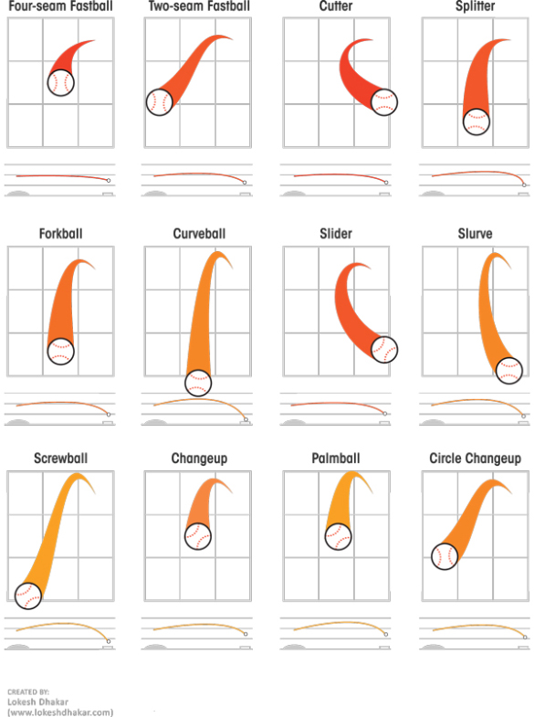
Descriptions Of Various Baseball Pitches
Now that you've looked at pictures of different baseball pitches, let's take a closer look at some of the more common ones - what they do and how they're used to get batters out.
- Four-seam fastball - Maximum velocity and should have best command. This is the most important pitch because everything else works off of it.
- Two-seam fastball (a.k.a. sinker) - This fastball does just that, it sinks. A very good pitch for inducing ground balls.
- Cut-fastball - Holding the ball slightly off center, it will run away from the arm side. Usually a few mph slower than a four-seam fastball. Good for jamming hitters.
- Split-finger fastball - Strictly an out pitch. Dives down hard at home plate, many times getting missed swings.
- Change-up - Slower than a fastball, but thrown with the same arm action. The arm speed is very important in getting the maximum effectiveness. This pitch helps control bat speed.
- Curveball - Most often a strikeout pitch. Dives down as it gets to home plate. Many times the velocity is as effective as the movement, because it's usually much slower than a fastball.
- Slider - In between a fastball and a curveball. It's harder than a curveball with less downward action. The slider has a smaller break with a tighter spin. Many times you can see a small dot in the baseball as it's coming toward you.
- Knuckleball - A pitch that has very little or no spin. It's very difficult to control and catch. No one knows what it will do usually, which makes it also hard to hit. A very hard pitch to throw.
- Forkball - Thrown hard while held between the index and middle fingers at varying depths. Usually tumbles and drops violently, often diagonally. Known as an out pitch, but also can be hard on the arm.
Location and ball-strike count
Now, let's evaluate the difference in Greinke's propensity to throw to each zone location depending on the count (i.e. number of balls and strikes).
# Create greinke_zone_tab
greinke_zone_tab <- table(greinke_sub$zone, greinke_sub$bs_count)

# Create zone_count_prop
zone_count_prop <- round(prop.table(greinke_zone_tab, margin = 2), 3)

# Print zone_count_prop
zone_count_prop
This table is a bit unwieldy, so let's try to break things down a bit in the following exercises.
0-2 vs. 3-0 locational changes
Let's create a table of differences for just the 0-2 and 3-0 counts.
# Create zone_count_diff
zone_count_diff <- zone_count_prop[,3] - zone_count_prop[,10]

# Print the table
zone_count_diff2 <- round(zone_count_diff, 3)
zone_count_diff2
Plotting count-based locational differences
Now that you have made a table of differences, it's time to plot this on the same zone grid that you used before.
# Add text to the figure for location differences
#for(i in 1:20) {
#  text(mean(greinke_sub$zone_px[greinke_sub$zone == i]),
#       mean(greinke_sub$zone_pz[greinke_sub$zone == i]),
#       zone_count_diff[i, ], cex = 1.5)
#}

# zone_count_diff is a d.f

plot(x = c(-2, 2), y = c(0, 5), type = "n",
     main = "Greinke Locational Zone Proportions",
     xlab = "Horizontal Location (ft.; Catcher's View)",
     ylab = "Vertical Location (ft.)")
grid(lty = "solid", col = "black")

text(x = -1.5, y = 4.5, zone_count_diff2[1], cex = 1.5)
text(x = -1.5, y = 3.5, zone_count_diff2[5], cex = 1.5)
text(x = -1.5, y = 2.5, zone_count_diff2[9], cex = 1.5)
text(x = -1.5, y = 1.5, zone_count_diff2[13], cex = 1.5)
text(x = -1.5, y = 0.5, zone_count_diff2[17], cex = 1.5)
text(x = -0.5, y = 4.5, zone_count_diff2[2], cex = 1.5)
text(x = -0.5, y = 3.5, zone_count_diff2[6], cex = 1.5)
text(x = -0.5, y = 2.5, zone_count_diff2[10], cex = 1.5)
text(x = -0.5, y = 1.5, zone_count_diff2[14], cex = 1.5)
text(x = -0.5, y = 0.5, zone_count_diff2[18], cex = 1.5)
text(x = 0.5, y = 4.5, zone_count_diff2[3], cex = 1.5)
text(x = 0.5, y = 3.5, zone_count_diff2[7], cex = 1.5)
text(x = 0.5, y = 2.5, zone_count_diff2[11], cex = 1.5)
text(x = 0.5, y = 1.5, zone_count_diff2[15], cex = 1.5)
text(x = 0.5, y = 0.5, zone_count_diff2[19], cex = 1.5)
text(x = 1.5, y = 4.5, zone_count_diff2[4], cex = 1.5)
text(x = 1.5, y = 3.5, zone_count_diff2[8], cex = 1.5)
text(x = 1.5, y = 2.5, zone_count_diff2[12], cex = 1.5)
text(x = 1.5, y = 1.5, zone_count_diff2[16], cex = 1.5)
text(x = 1.5, y = 0.5, zone_count_diff2[20], cex = 1.5)

It definitely looks like Greinke is throwing pitches to the middle of the strike zone less often in 0-2 counts here. That makes sense.
Pitches in difference situations. Bin the data to organized the important amount of information. In July, Greinke thow off-center and outside the batter. Uses its 2-seam fastball in July, a 2-seam is more off-center. Pitches depend on the ball-strike count. In 0-2, pitches are low; in 3-0, pitches are close to the center with a 4-seam fastball.
Velocity impact on contact rate
It might be worthwhile to know if increased velocity is even associated with better outcomes for Greinke. After all, this was the implication when you compared July's velocity to other months.
Analyze the impact of velocity on the likelihood that a pitch is missed by the batter. You will begin with the greinke_ff dataset, now including all the new variables we've created. Rather than compare across months, you will simply look at the impact of start_speed on the rate that the batter makes contact.
greinke_ff <- read.table(file = 'Baseball_ff.csv', header = TRUE, sep = ';')
str(greinke_ff)
# Create batter_swing
no_swing <- c("Ball", "CalledStrike", "BallinDirt", "HitByPitch")
greinke_ff$batter_swing <- ifelse(greinke_ff$pitch_result %in% no_swing, 0, 1)

# Create swing_ff
swing_ff <- subset(greinke_ff, greinke_ff$batter_swing == 1)

# Create the contact variable
no_contact <- c("SwingingStrike", "MissedBunt")
swing_ff$contact <- ifelse(swing_ff$pitch_result %in% no_contact, 0, 1)

# Create velo_bin: add one line for "Fast"
swing_ff$velo_bin <- ifelse(swing_ff$start_speed < 90.5, "Slow", NA)

swing_ff$velo_bin <- ifelse(swing_ff$start_speed >= 90.5 & swing_ff$start_speed < 92.5, "Medium", swing_ff$velo_bin)

swing_ff$velo_bin <- ifelse(swing_ff$start_speed >= 92.5, "Fast", swing_ff$velo_bin)

# Aggregate contact rate by velocity bin
tapply(swing_ff$contact, swing_ff$velo_bin, mean)
Pitch type impact on contact rate
Now that you have seen the relationship between fastball start_speed and contact rate, let's explore the relationship between pitch_type and contact rate.
This time, because average start_speed varies by pitch_type, you will need to reconfigure your velo_bin variable. Specifically, structure this into 3 groups for each pitch, with each group the within-pitch start_speed.
The swings dataset, which includes only pitches at which a batter has swung, has been created for you. Also note that we have written a new function called bin_pitch_speed() for use in calculating quantiles.
swings <- read.table(file = 'Baseball_swings.csv', header = TRUE, sep = ';')
str(swings)
# Create the subsets for each pitch type
swing_ff <- subset(swings, pitch_type == "FF")
swing_ch <- subset(swings, pitch_type == "CH")
swing_cu <- subset(swings, pitch_type == "CU")
swing_ft <- subset(swings, pitch_type == "FT")
swing_sl <- subset(swings, pitch_type == "SL")
# create a function
bin_pitch_speed <- function(start_speed)
{
    as.integer(cut(start_speed, quantile(start_speed, probs = 0:3 / 3), include.lowest = TRUE))
}
# Make velo_bin_pitch variable for each subset
swing_ff$velo_bin <- bin_pitch_speed(swing_ff$start_speed)
swing_ch$velo_bin <- bin_pitch_speed(swing_ch$start_speed)
swing_cu$velo_bin <- bin_pitch_speed(swing_cu$start_speed)
swing_ft$velo_bin <- bin_pitch_speed(swing_ft$start_speed)
swing_sl$velo_bin <- bin_pitch_speed(swing_sl$start_speed)

# Print quantile levels for each pitch
thirds <- c(0, 1/3, 2/3, 1)
quantile(swing_ff$start_speed, probs = thirds)
quantile(swing_ch$start_speed, probs = thirds)
quantile(swing_cu$start_speed, probs = thirds)
quantile(swing_ft$start_speed, probs = thirds)
quantile(swing_sl$start_speed, probs = thirds)
Velocity impact on contact by pitch type
Now that you've created your new velo_bin variable, in this exercise you will evaluate whether there is any relationship between start_speed and contact rate by pitch type.
# Calculate contact rate by velocity for swing_ff
tapply(swing_ff$contact, swing_ff$velo_bin, mean)

# Calculate contact rate by velocity for swing_ft
tapply(swing_ft$contact, swing_ft$velo_bin, mean)

# Calculate contact rate by velocity for swing_ch
tapply(swing_ch$contact, swing_ch$velo_bin, mean)

# Calculate contact rate by velocity for swing_cu
tapply(swing_cu$contact, swing_cu$velo_bin, mean)

# Calculate contact rate by velocity for swing_sl
tapply(swing_sl$contact, swing_sl$velo_bin, mean)
It's interesting to see that the relationship between contact rate and velocity for other pitches is less clear than it was for four-seam fastballs.
Greinke's out pitch?
While there wasn't much happening with velocity within pitch type in the previous exercise, it can often be useful to think about situational characteristics of pitching. Take a look at Greinke's propensity to use certain pitches in 2-strike counts.
Specifically, it might be interesting to know if Greinke uses certain pitches in 2-strike counts more often than others. And, if so, are they more successful in getting a swing and a miss? Or are certain pitches getting more outs when they're put in play?
The dataset called swings has been loaded, now with the velo_bin variable, which stacks the 5 pitch type subsets you made in the previous exercises. You will use this new dataset here.
# Create swings_str2
swings_str2 <- subset(swings, swings$strikes == 2)

# Print number of observations
nrow(swings_str2)

# Print a table of pitch use
pitch_tab <- table(swings_str2$pitch_type)
pitch_tab

# Calculate contact rate by pitch type
contact_rate <- round(tapply(swings_str2$contact, swings_str2$pitch_type, mean), 3)
contact_rate
Describe 2-strike pitch usage
The tables you created in the last exercise have been loaded into your workspace as pitch_tab and contact_rate.
Which pitch did Greinke use most in 2-strike counts in 2015 and which was most successful in getting swings and misses?
pitch_tab
 CH  CU  FF  FT  SL
115  15 182  50 198
contact_rate
CH CU FF FT SL
0.774 0.867 0.846 0.800 0.798
He used his slider (SL) most often, but his curveball (CU) was most successful.
Impact of pitch location on contact rate
Now, instead of velocity, visualize contact rates based on location. Here, only look at the zone areas that are near the strike zone (in this case, zones 6, 7, 10, 11, 14, and 15).
Begin by calculating the contact rate for each zone separately for right- and left-handed batters. Then, you'll use what you learned from previous exercises to plot() them on a figure.
# Create subset of swings: swings_rhb
swings_lhb <- subset(swings, swings$batter_stand == "L")

# Create subset of swings: swings_lhb
swings_rhb <- subset(swings, swings$batter_stand == "R")

# Create zone_contact_r
zone_contact_l <- round(tapply(swings_lhb$contact, swings_lhb$zone, mean), 3)

# Create zone_contact_l
zone_contact_r <- round(tapply(swings_rhb$contact, swings_rhb$zone, mean), 3)

# Plot figure grid for RHB
par(mfrow = c(1, 2))
plot(x = c(-1, 1), y = c(1, 4), type = "n",
     main = "Contact Rate by Location (RHB)",
     xlab = "Horizontal Location (ft.; Catcher's View)",
     ylab = "Vertical Location (ft.)")
abline(v = 0)
abline(h = 2)
abline(h = 3)

# Add text for RHB contact rate
for(i in unique(c(6, 7, 10, 11, 14, 15))) {
  text(mean(swings_rhb$zone_px[swings_rhb$zone == i]),
       mean(swings_rhb$zone_pz[swings_rhb$zone == i]),
       zone_contact_r[rownames(zone_contact_r) == i], cex = 1.5)
}

# Add LHB plot
plot(x = c(-1, 1), y = c(1, 4), type = "n",
     main = "Contact Rate by Location (LHB)",
     xlab = "Horizontal Location (ft.; Catcher's View)",
     ylab = "Vertical Location (ft.)")
abline(v = 0)
abline(h = 2)
abline(h = 3)

# Add text for LHB contact rate
for(i in unique(c(6, 7, 10, 11, 14, 15))) {
  text(mean(swings_lhb$zone_px[swings_lhb$zone == i]),
       mean(swings_lhb$zone_pz[swings_lhb$zone == i]),
       zone_contact_l[rownames(zone_contact_l) == i], cex = 1.5)
}

It looks like low pitches are much more difficult for batters to make contact with when they swing. Maybe Greinke should keep his pitches down, especially against lefties!
Rethinking the use of for loops
Use the seq() and rep() functions to create vectors of coordinates for each zone. Then, put these together in a new data frame. This data frame will be added to and used for plotting.
# Create vector px
px <- rep(seq(from = -1.5, to = 1.5, by = 1), times = 5)

# Create vector pz
pz <- rep(seq(from = 4.5, to = 0.5, by = -1), each = 4)

# Create vector of zone numbers
zone <- seq(from = 1, to = 20, by = 1)

# Create locgrid
locgrid <- data.frame(zone, px, pz)

# Print locgrid
locgrid
Contact rate with ggplot2
The zone_contact_r and zone_contact_l tables are now stored as data frames with two columns: the contact rate and the zone number. Note that not all 20 zones have data for both left- and right-handed batters.
Now, let's put these data frames to work with the help of locgrid and ggplot2 to make some plots without using any for loops!
# load the gridExtra package
library(gridExtra)
locgrid <- read.table(file = 'locgrid.csv', header = TRUE, sep = ';')
str(locgrid)
zone_contact_r <- read.table(file = 'zone_contact_r.csv', header = TRUE, sep = ';')
zone_contact_l <- read.table(file = 'zone_contact_l.csv', header = TRUE, sep = ';')
str(zone_contact_r)
str(zone_contact_l)
# Examine new contact data
zone_contact_r
zone_contact_l
# Merge locgrid with zone_contact_r
# Specify two additional arguments: by = "zone", which tells R which column to match on, and all.x = TRUE, which will make sure you don't lose any zones (1-20)
locgrid <- merge(locgrid, zone_contact_r, by = "zone", all.x = TRUE)

# Merge locgrid with zone_contact_l
locgrid <- merge(locgrid, zone_contact_l, by = "zone", all.x = TRUE)
# Print locgrid to the console
locgrid
Adding titles and axes to ggplot2 figure
It's time to add a title and axis labels to your plots. This is done using the ggtitle() and labs() functions in the ggplot2 package.
The default title text size is a bit small sometimes: make use of the theme() function in the ggplot2 package.
library(ggplot2)
# add this package for more colors
library(RColorBrewer)
# Make base grid with ggplot()
plot_base_grid <- ggplot(locgrid, aes(x = px, y = pz))

# Arrange the plots side-by-side
# from the gridExtra package
grid.arrange(plot_base_grid, ncol = 2, plot_base_grid)

# Adding text for contact rate values
# Make RHB plot
plot_titles_rhb <- plot_base_grid +
  ggtitle("RHB Contact Rates") +
  labs(x = "Horizontal Location(ft.; Catcher's View)",
       y = "Vertical Location (ft.)") +
  theme(plot.title = element_text(size = 15))

# Make LHB plot
plot_titles_lhb <- plot_base_grid +
  ggtitle("LHB Contact Rates") +
  labs(x = "Horizontal Location(ft.; Catcher's View)",
       y = "Vertical Location (ft.)") +
  theme(plot.title = element_text(size = 15))

# Display both side-by-side
grid.arrange(plot_titles_lhb, plot_titles_rhb, ncol = 2)

Making a heat map - visualizing hot and cold zones
Visualizing probabilities on a grid can often be improved by using color. In this case, the figure could be referred to as a heat map. There are several ways to build heat maps in R, but in this exercise, you'll do it with ggplot2.
The color of each zone in your heat map will correspond to the probability of making contact. Scaling colors in this way gives an additional visual edge so that the locational impact on contact rate can be inferred and compared more quickly.
The geom_tile() function does this automatically, but you will customize the color scheme with the scale_fill_gradientn() function in combination with brewer.pal() from the RColorBrewer package. (RColorBrewer provides some nice color schemes that would be time-consuming to reproduce manually. You will use mostly red colors here, but you can type display.brewer.all() in the R console to see the available color palattes.)
Darker and lighter shades of red will indicate higher and lower contact rates, respectively.
# Make RHB plot
plot_colors_rhb <- plot_titles_rhb +
  geom_tile(aes(fill = contact_rate_r)) +
  scale_fill_gradientn(name = "Contact Rate",
                       limits = c(0.5, 1),
                       breaks = seq(from = 0.5, to = 1, by = 0.1),
                       colors = c(brewer.pal(n = 7, name = "Reds")))

# Make LHB plot
plot_colors_lhb <- plot_titles_lhb +
  geom_tile(aes(fill = contact_rate_l)) +
  scale_fill_gradientn(name = "Contact Rate",
                       limits = c(0.5, 1),
                       breaks = seq(from = 0.5, to = 1, by = 0.1),
                       colors = c(brewer.pal(n = 7, name = "Blues")))

# Display plots side-by-side
grid.arrange(plot_colors_lhb, plot_colors_rhb, ncol = 2)

Adding text for contact rate values
Now, show the actual contact_rate value within each zone box. You already did this before with your for loops. However, ggplot2() allows this to be done a bit more easily with the locgrid data frame and a new function called annotate().
Here, you will simply be adding the additional parameters to the plot_colors_rhb and plot_colors_lhb objects.
# Make RHB plot
plot_contact_rhb <- plot_colors_rhb +
  annotate("text", x = locgrid$px, y = locgrid$pz,
           label = locgrid$contact_rate_r, size = 3)

# Make LHB plot
plot_contact_lhb <- plot_colors_lhb +
  annotate("text", x = locgrid$px, y = locgrid$pz,
           label = locgrid$contact_rate_l, size = 3)

# Plot them side-by-side
grid.arrange(plot_contact_lhb, plot_contact_rhb, ncol = 2)

Contact and exit speed
While contact rate can be a useful measure for knowing how successful a pitcher is, there are other ways to measure outcomes. Begin to work with the batted_ball_velocity variable. This measures how hard the ball was hit by the batter.
Unfortunately, there is also a large amount of missing data in the batted_ball_velocity variable. For our purposes here, we'll assume that there's no pattern to which data are missing, so you'll simply remove any observations that are missing a value for this variable.
# Create pcontact
pcontact <- subset(swings, swings$contact == 1 & !is.na(swings$batted_ball_velocity))

# Create pcontact_r
pcontact_r <- subset(pcontact, pcontact$batter_stand == "R")

# Create pcontact_l
pcontact_l <- subset(pcontact, pcontact$batter_stand == "L")
Location and exit speed
Get the average batted_ball_velocity by zone using tapply() and plot it as text on your zone grid. The pcontact_r and pcontact_l data, in addition to the locgrid data, are available in the workspace.
# Create exit_speed_r
exit_speed_r <- data.frame(tapply(pcontact_r$batted_ball_velocity,
                                  pcontact_r$zone, mean))
exit_speed_r <- round(exit_speed_r, 1)
colnames(exit_speed_r) <- "exit_speed_rhb"
exit_speed_r$zone <- row.names(exit_speed_r)

# Create exit_speed_l
exit_speed_l <- data.frame(tapply(pcontact_l$batted_ball_velocity,
                                  pcontact_l$zone, mean))
exit_speed_l <- round(exit_speed_l, 1)
colnames(exit_speed_l) <- "exit_speed_lhb"
exit_speed_l$zone <- row.names(exit_speed_l)

# Merge with locgrid
locgrid <- merge(locgrid, exit_speed_l, by = "zone", all.x = T)
locgrid <- merge(locgrid, exit_speed_r, by = "zone", all.x = T)

# Print locgrid
locgrid
Plotting exit speed as a heat map
Use the swings dataset to plot exit speed by zone location with ggplot2.
As with contact_rate, use the exit_speed information from locgrid to create a heat map of exit speed by location.
# Create LHB exit speed plotting object
plot_exit_lhb <- plot_base_grid +
  geom_tile(data = locgrid, aes(fill = exit_speed_lhb)) +
  scale_fill_gradientn(name = "Exit Speed (mph)",
                       limits = c(60, 95),
                       breaks = seq(from = 60, to = 95, by = 5),
                       colors = c(brewer.pal(n = 7, name = "Blues"))) +
  annotate("text", x = locgrid$px, y = locgrid$pz,
           label = locgrid$exit_speed_rhb, size = 3) +
  ggtitle("LHB Exit Velocity (mph)") +
  labs(x = "Horizontal Location(ft.; Catcher's View)",
       y = "Vertical Location (ft.)") +
  theme(plot.title = element_text(size = 15))

# Create RHB exit speed plotting object
plot_exit_rhb <- plot_base_grid +
  geom_tile(data = locgrid, aes(fill = exit_speed_rhb)) +
  scale_fill_gradientn(name = "Exit Speed (mph)",
                       limits = c(60, 95),
                       breaks = seq(from = 60, to = 95, by = 5),
                       colors = c(brewer.pal(n = 7, name = "Reds"))) +
  annotate("text", x = locgrid$px, y = locgrid$pz,
           label = locgrid$exit_speed_rhb, size = 3) +
  ggtitle("RHB Exit Velocity (mph)") +
  labs(x = "Horizontal Location(ft.; Catcher's View)",
       y = "Vertical Location (ft.)") +
  theme(plot.title = element_text(size = 15))

# Plot each side-by-side
grid.arrange(plot_exit_lhb, plot_exit_rhb, ncol = 2)

Using tidy data and facets in ggplot2
Creating side-by-side plots for with the grid_arrange() function misses an important aspect of plotting with ggplot2: facets. Facets are used to create separate windows for plotting information about different groups; in this case, right- and left-handed batters. They can also automatically scale the heat map colors.
Facets require the restructuration of the locgrid dataset. This has been done for you, and is preloaded as a new dataset called exit_tidy. We have removed the contact rate information, so exit_tidy only includes information on exit_speed.
exit_tidy <- read.table(file = 'exit_tidy.csv', header = TRUE, sep = ';')
str(exit_tidy)
# Examine head() and tail() of exit_tidy
head(exit_tidy)
tail(exit_tidy)
# Create plot_exit
plot_exit <- plot_base_grid +
  geom_tile(data = exit_tidy, aes(fill = exit_speed)) +
  scale_fill_gradientn(name = "Exit Speed (mph)",
                       colors = c(brewer.pal(n = 7, name = "Reds"))) +
  ggtitle("Exit Speed (mph)") +
  labs(x = "Horizontal Location(ft.; Catcher's View)",
       y = "Vertical Location (ft.)") +
  theme(plot.title = element_text(size = 15)) +
  facet_grid(. ~ batter_stand)

# Display plot_exit
plot_exit

Some randomness in baseball outcomes
Despite trends and correlations, everything might not have a cause... Good luck in July or other reasons, Greinke overall outcomes were good.
In 2015, Greinke was in the top-10 best pitcher (7th).
More
Baseball data is publicky available. We can use it to analyze pitching, batting, catching, umpireing, and fielding.